Fostering brand identity through packaging
14
I choose wine based on the design of the label. I’m a designer so this is probably expected but recent research on packaging design proves I’m not alone…
A study* found that:
• 72% of consumers agree that package design can influence their purchasing decisions
A survey^ found that:
• 53% of consumers said that they are drawn to packaging with bright, pleasing colors
• 33% consumers said they are likely to dismiss a product if they don’t like the label design
*Conducted by Paper and Packaging Board and global market research firm IPSOS
^Lakewood, N.J.-based Luminer
- – -
Article credit:https://www.bakingbusiness.com/articles/46420-fostering-brand-identity-through-packaging
By Lynn Petrak
While you’re not supposed to judge a book by its cover, people certainly do judge packaging by its appearance, whether they are buying in a retail store or online.
A recent study conducted by the Paper and Packaging Board and global market research firm IPSOS found that 72% of consumers agree that package design can influence their purchasing decisions. Another survey released this year, from Lakewood, N.J.-based Luminer, shows that more than half of consumers (53%) said that they are drawn to packaging with bright, pleasing colors and, on the flip side, a good third (33%) said they are likely to dismiss a product if they don’t like the label design.
Package design experts also underscore the importance of design, including form, material and visuals, in enticing consumers.
“Packaging is always one of the biggest marketing tools and challenges a brand has when trying to compete,” said Hakyun Lee, vice-president of Dot Matrix Design Group. “Today’s landscape in retail is extremely competitive, especially dealing with new brands popping up and with store brands upping their game.”
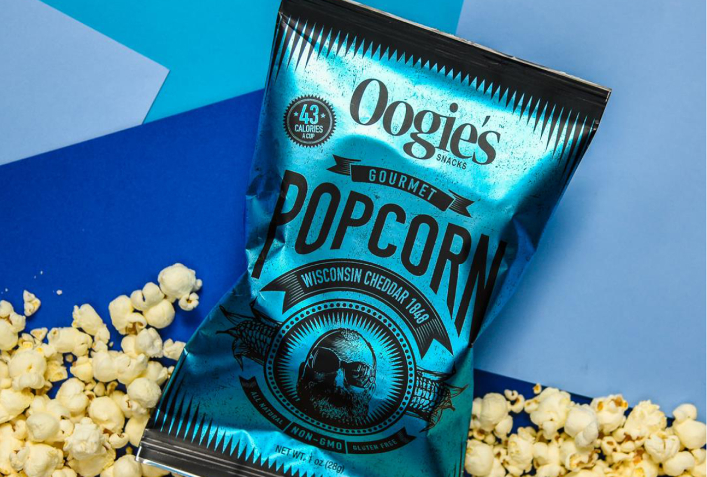
With improved materials and aesthetic capabilities, manufacturers are indeed upping their game when it comes to design. Dot Matrix recently worked with Oogie’s Popcorn on a package redesign and upgrade. Mr. Lee said Dot Matrix’s designers took advantage of improvements in foil substrates and overprinted color on foil for a metallic effect that stands out on the shelf and page. The brightly colored bags feature a rendering of the newly-created Oogie “man,” which literally and figuratively adds character to the package.
The bakery and snack marketplace is replete with examples of innovation in package graphics, materials and formats. Bobo’s recently introduced a new toaster pastry under the TOAST’R brand name, available in a colorful windowed package so shoppers can glimpse the actual product as their eye is drawn to the fun illustration and vibrant hues.
When it comes to the whole package, so to speak, the product name can be a focal point of the package design. That’s true for the nutrition bar called This Bar Saves Lives; the impact brand, founded by a small group of actors/actresses who wanted to donate proceeds to help fight malnutrition and hunger on a global scale, recently redesigned the package and logo for that product to make a colorful statement that matched the bold product name.
Along lines of messaging, the brand That’s It unveiled new minimalist packaging that mirrors the minimal ingredients in the health and wellness bar. The copy on the blueberry-apple variety is simply “1 apple + 20 blueberries” under the That’s It name, accompanied by photos of one apple and 20 blueberries and with some additional short descriptors about 100 calories and non-G.M.O. and no sugar added.
By balancing design and messaging, food manufacturers can reach their core consumers and continue to build their brand’s identity.
Category tags: Industry Insights , Branding