Dropbox Wants to Unlock Creativity With an Unexpected Rebrand That Features a Trippy Video
04
Dropbox has revealed a refreshed logo and launched a new branding and marketing campaign in a bid to set themselves apart from their competition and communicate their mission to ‘unlock creativity’.
- – -
Article Credit: https://www.adweek.com/brand-marketing/dropbox-wants-to-unlock-creativity-with-an-unexpected-rebrand-that-features-a-trippy-video/
By Katie Richards
“We play in an increasingly crowded and competitive category,” said Dropbox CMO Carolyn Feinstein. “It’s really important for us to be able to carve out a unique positioning that feels really true to who we are and true to the impact we want to have in the world.”
Dropbox Wants to Unlock Creativity With an Unexpected Rebrand That Features a Trippy Video
The campaign also includes a new logo
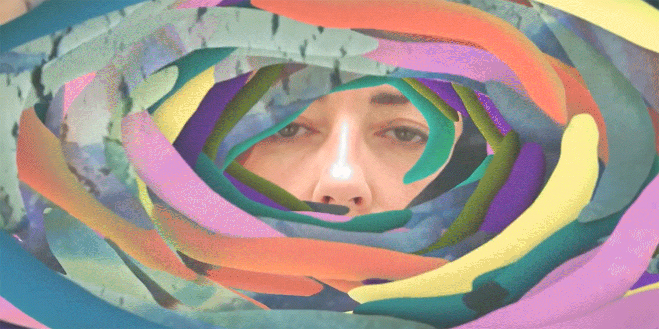
Dropbox is kicking off a new wave of marketing and branding with an intriguing anthem spot that ties back to the brand’s new messaging that “the world needs your creative energy.” In the 60-second digital film, the brand debuts work from a handful of artists who will be featured in the overall integrated campaign. The mission across the board is to unlock creativity.
“At Dropbox, we had for a long time had this quite differentiated, thoughtful, authentic perspective on modern work and our optimistic belief that there is a better way. … We play in an increasingly crowded and competitive category,” said Dropbox CMO Carolyn Feinstein. “It’s really important for us to be able to carve out a unique positioning that feels really true to who we are and true to the impact we want to have in the world.”
All kinds of people and companies use Dropbox to make their daily work lives easier—from a research center turning skin cells into heart cells to Childish Gambino.
“If you are someone that needs to build great work together—whether it’s a magazine, or a feature film, or a television show, or a fashion line—[Dropbox] often sits at the center of that creative experience. A lot of people talk about the fact that they couldn’t have done that work without Dropbox,” Feinstein said.
Dropbox hopes to rebrand itself as the space where creators can share and edit their work through the launch of it’s first truly global campaign. Starting today, it will roll out in the U.S., U.K., Canada and Australia. Over time, the brand says, it will expand to more markets. 72andSunny Los Angeles created the campaign, while Starcom handled global media. Additionally, Dropbox worked with design agency Collins in New York and San Francisco for the rebrand.
Not only is the brand debuting a new film to celebrate the new vibe, Dropbox is also refreshing its now 10-year-old logo. It’s not wildly different, but it is a bit sleeker and cleaner. Plus, users will also notice a new expressive typeface, which has 250 different weights and sizes, again hitting on the fact that from here on out, Dropbox will be more creative, playful and differentiated in its marketing.
Dropbox is also adopting a bunch of new colors in its messaging. Before, the brand relied heavily on its go-to tech blue and white combination (think Facebook, Twitter, LinkedIn). That won’t go away, but Dropbox hopes to add a bit more flair in the future with unexpected color combinations. A lot of the inspiration for the combinations came from the Dropbox headquarters in San Francisco.
“What this allows us to do is in different environments express ourselves in a way that makes sense for that situation,” Feinstein said. “Sometimes, especially in products when we want to back up a little bit and put the showcase on the work and people using our products, we will stay really blue and white. In other cases, our palette is much richer and able to flex into different environments in the places we might show up while also giving a nod to the creativity of our users.”
Take for example Dropbox’s illustrations. The brand relied heavily on illustrations when it first kicked off its marketing a decade ago.
“At the time when we were using the illustration style, it was revolutionary,” Feinstein said. “This idea of humanizing technology by using illustration was really fresh and really new.”
In the past few years though Dropbox noticed that a lot of different brands caught on to this look and the idea of using fun illustrations to humanize their brands.
“We lost our uniqueness in using this and admittedly, we allowed our own illustration style to become a bit less whimsical and a bit more corporate and as such, we moved closer and closer to the competition,” Feinstein said.
Dropbox will continue to use illustrations in its new era of marketing, but the idea now is to have it feel very hand drawn and pull in some of those new color combinations to liven them up a bit more.
Over the coming months, the brand will continue to roll out more digital and social components to the campaign as well as some outdoor work, which will mostly be strategically placed in cities and neighborhoods where creative people tend to live and work in order to inspire them, according to Feinstein.
A final component of the campaign relies on the concept of co-creation. In all the outdoor ads around the world, consumers will notice two distinctly different images created in totally different styles merged into one single image (see some examples below).
“Collaboration is an overused word I think both in our industry and it’s also a word that creative people don’t love very much. We really prefer to think about this idea of co-creation and bringing people together to do extraordinary things,” added Feinstein.
Category tags: Industry Insights , Branding